2025
Avia Clinic
AVIA Clinic represents a forward-thinking, holistic, and accessible healthcare brand.
Visual Identity
Healthcare
Know More
AVIA Clinic, UK was founded with a mission to make quality healthcare accessible, personal, and truly patient-centric. Recognizing the evolving needs of individuals and families, AVIA offers both in-person consultations and telephonic care—making it adaptable to modern lifestyles.
Reflects innovation in both in-person and remote consultations.
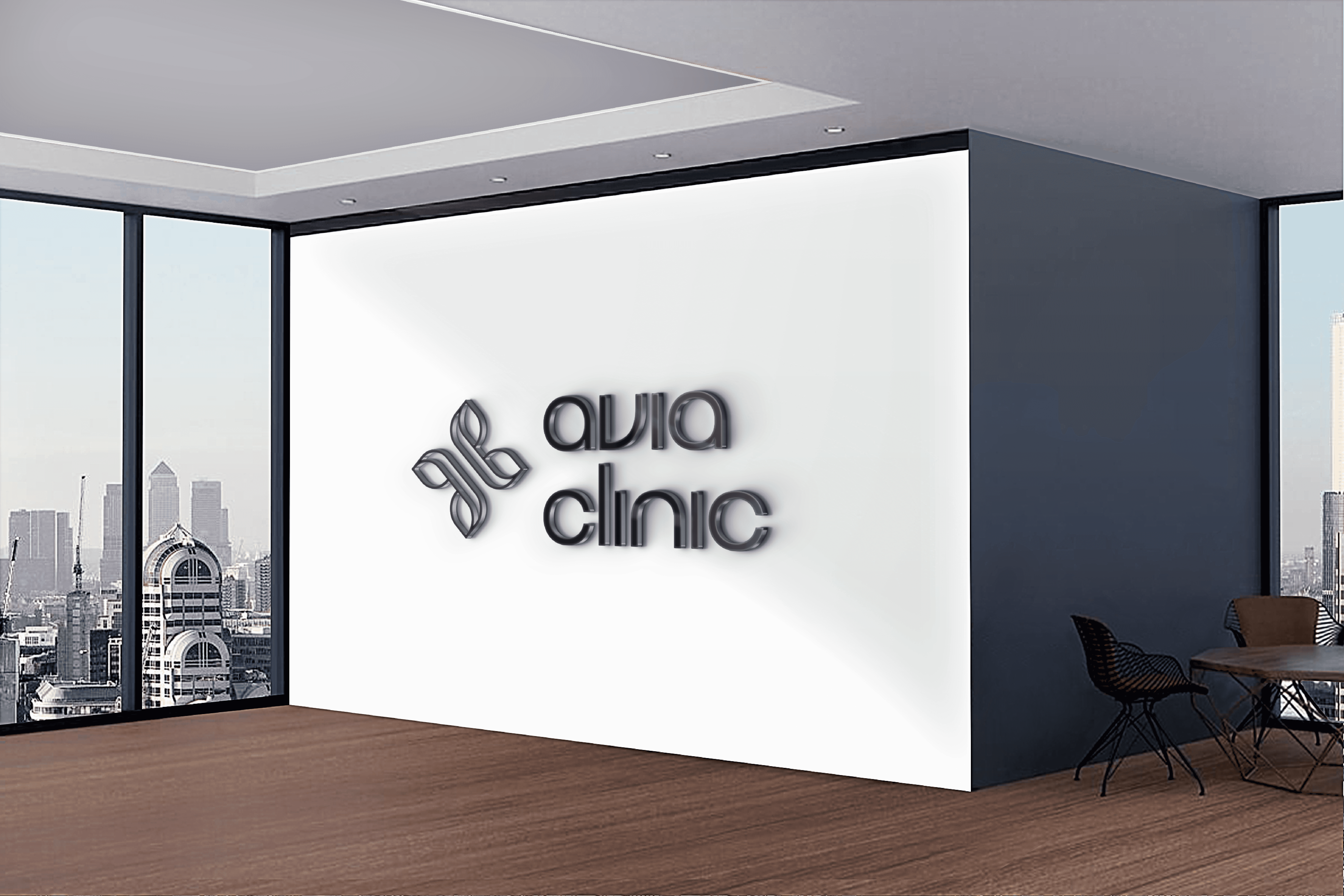
The name "AVIA" loosely stands for Advanced Virtual and In-Person Assistance, reflecting its hybrid model of care. It also draws inspiration from ideas of ease, approachability, and continuity in care. Its circular logo symbolizes wholeness and healing, echoing the clinic’s commitment to holistic well-being. By blending professional expertise with a deeply human approach, AVIA Clinic stands at the intersection of innovation, empathy, and reach.
Problem
Healthcare branding often feels cold, corporate, and disconnected.
In today’s fast-changing world, patients seek more than just treatment—they seek empathy, clarity, and a personal connection.
Avia Clinic needed a strong, clean, and adaptable identity that communicates:
Its focus on holistic healing
Its forward-thinking medical philosophy
Its UK-based professionalism, with an international design appeal
The challenge was to strike the right balance between medical precision and emotional depth, and to make it scalable across print, digital, and spatial applications.
Solution
We crafted a fresh, distinct, and versatile brand identity system—one that brings modern design language into the world of holistic healthcare.
Our approach focused on delivering:
A calming yet confident identity fitting the UK healthcare landscape
Organic forms and minimalist structure, symbolising the harmony of science and nature
A digitally native, globally scalable visual language
This wasn’t just a logo—it became a resting place for the brand’s mission: to heal completely, and communicate authenticity at every touchpoint.
Concept
Symbolising Holistic Healing Through Form and Function
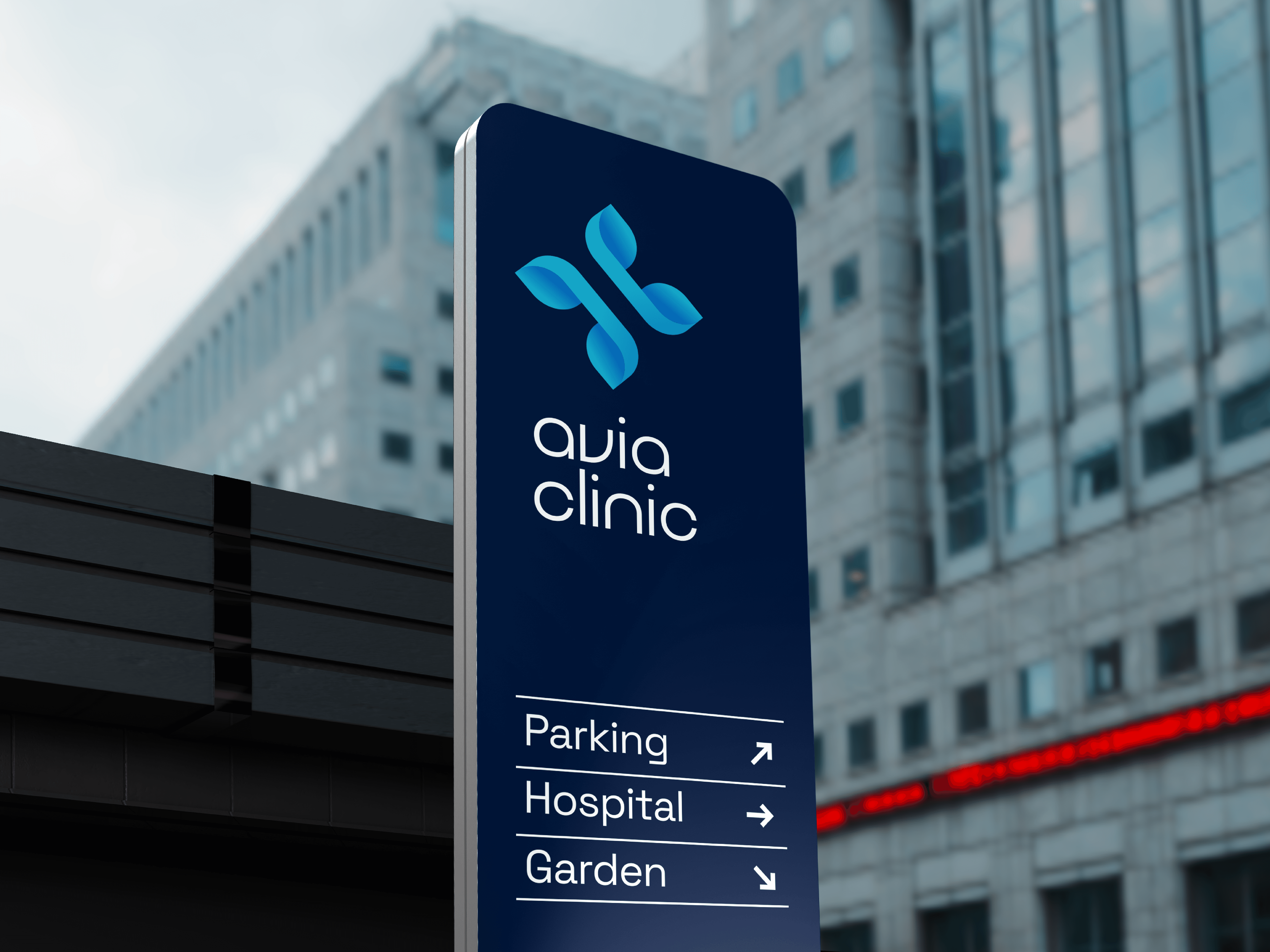
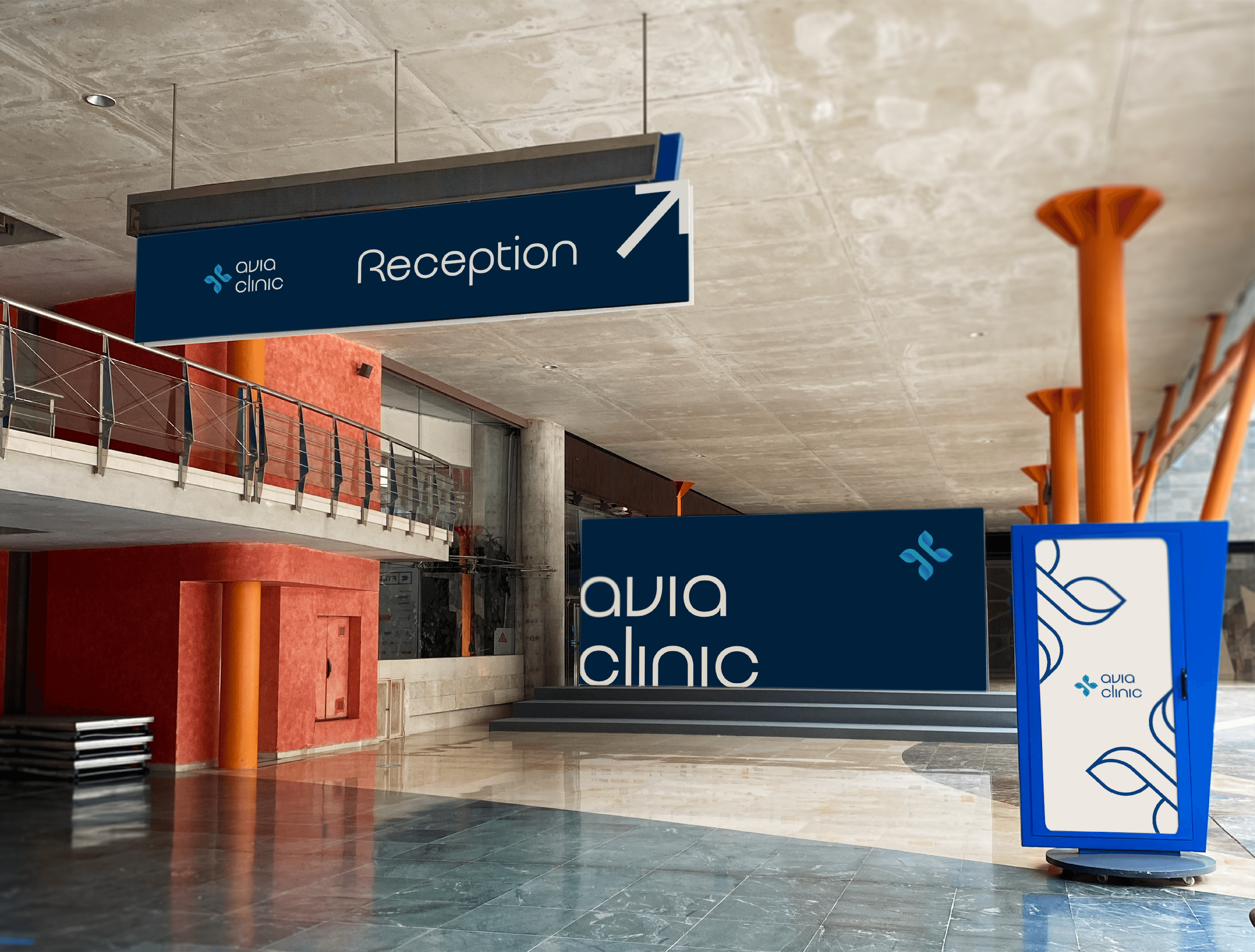
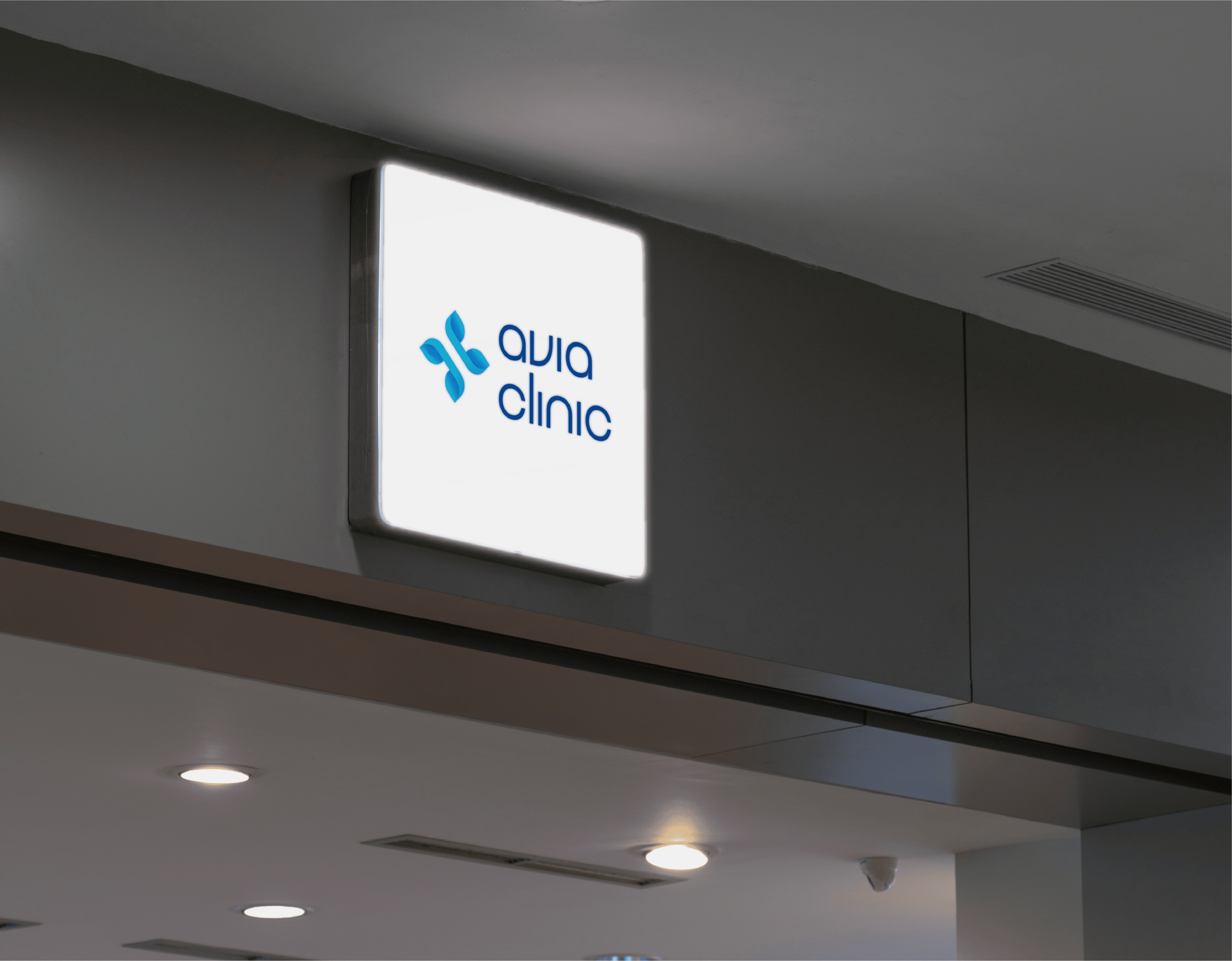
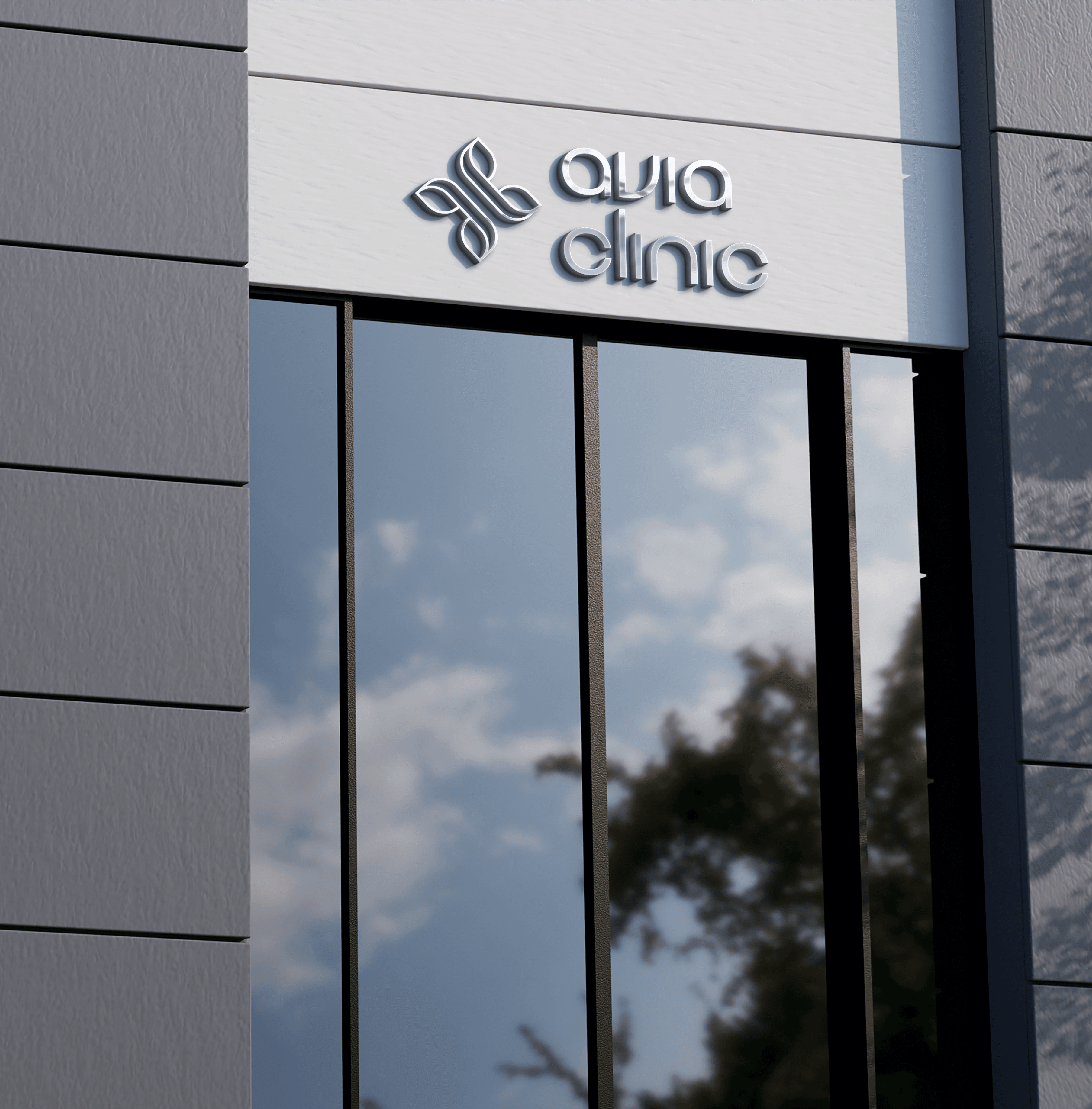
The core idea behind the Avia Clinic identity was to seamlessly blend medical precision with emotional warmth, reflecting the clinic’s holistic approach to well-being. The logo design revolves around four interwoven leaves that form a cross—subtly referencing the universal medical symbol while introducing organic elements that evoke balance, nature, and care. This intersection of form captures the essence of holistic health, encompassing mental, physical, emotional, spiritual, and social harmony. The curvature of the shapes and the circular flow within the icon reflect the continuity of care, while the soft geometry reinforces calmness and trust. The custom logotype, using the Quroua typeface, carries a contemporary, humanised tone, making the brand feel both modern and approachable. The colour palette—shades of calming and professional blues—enhances the sense of serenity, comfort, and digital relevance. Altogether, the concept brings to life a visual identity that is memorable, minimal, and meaningful—perfectly suited for a new-generation clinic in the UK.
More Works
©2024
FAQ
01
What does a project look like?
02
How is the pricing structure?
03
Are all projects fixed scope?
04
What is the ROI?
05
How do we measure success?
06
What do I need to get started?
07
Can I hire Gallop for just one part of the branding process?
08
Do you work with clients outside India?
2025
Avia Clinic
AVIA Clinic represents a forward-thinking, holistic, and accessible healthcare brand.
Visual Identity
Healthcare
Know More
AVIA Clinic, UK was founded with a mission to make quality healthcare accessible, personal, and truly patient-centric. Recognizing the evolving needs of individuals and families, AVIA offers both in-person consultations and telephonic care—making it adaptable to modern lifestyles.
Reflects innovation in both in-person and remote consultations.
The name "AVIA" loosely stands for Advanced Virtual and In-Person Assistance, reflecting its hybrid model of care. It also draws inspiration from ideas of ease, approachability, and continuity in care. Its circular logo symbolizes wholeness and healing, echoing the clinic’s commitment to holistic well-being. By blending professional expertise with a deeply human approach, AVIA Clinic stands at the intersection of innovation, empathy, and reach.
Problem
Healthcare branding often feels cold, corporate, and disconnected.
In today’s fast-changing world, patients seek more than just treatment—they seek empathy, clarity, and a personal connection.
Avia Clinic needed a strong, clean, and adaptable identity that communicates:
Its focus on holistic healing
Its forward-thinking medical philosophy
Its UK-based professionalism, with an international design appeal
The challenge was to strike the right balance between medical precision and emotional depth, and to make it scalable across print, digital, and spatial applications.
Solution
We crafted a fresh, distinct, and versatile brand identity system—one that brings modern design language into the world of holistic healthcare.
Our approach focused on delivering:
A calming yet confident identity fitting the UK healthcare landscape
Organic forms and minimalist structure, symbolising the harmony of science and nature
A digitally native, globally scalable visual language
This wasn’t just a logo—it became a resting place for the brand’s mission: to heal completely, and communicate authenticity at every touchpoint.
Concept
Symbolising Holistic Healing Through Form and Function
The core idea behind the Avia Clinic identity was to seamlessly blend medical precision with emotional warmth, reflecting the clinic’s holistic approach to well-being. The logo design revolves around four interwoven leaves that form a cross—subtly referencing the universal medical symbol while introducing organic elements that evoke balance, nature, and care. This intersection of form captures the essence of holistic health, encompassing mental, physical, emotional, spiritual, and social harmony. The curvature of the shapes and the circular flow within the icon reflect the continuity of care, while the soft geometry reinforces calmness and trust. The custom logotype, using the Quroua typeface, carries a contemporary, humanised tone, making the brand feel both modern and approachable. The colour palette—shades of calming and professional blues—enhances the sense of serenity, comfort, and digital relevance. Altogether, the concept brings to life a visual identity that is memorable, minimal, and meaningful—perfectly suited for a new-generation clinic in the UK.
More Works
©2024
FAQ
What does a project look like?
How is the pricing structure?
Are all projects fixed scope?
What is the ROI?
How do we measure success?
What do I need to get started?
Can I hire Gallop for just one part of the branding process?
Do you work with clients outside India?